Bring the fresh look of the coastal regions into your dining room decor. This is a feeling, rather than strictly just one style. Consider such widely ranged stylings as Savannah Southern Traditional, New England Maine, West Coast Casual, Gulf Coast Beach House, All have hints of the ocean, seashore living, and good times in common.
Gulf Coast Sophistication
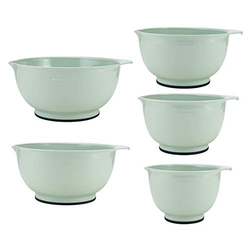
The formal look of polished wood, celadon green placemats, a gracious living mark this look as truly Southern but with a soft and easy look that came from those sweet Gulf breezes.
The formal look of polished wood, celadon green placemats, a gracious living mark this look as truly Southern but with a soft and easy look that came from those sweet Gulf breezes.
Half the fun of a beach house is the way you can kick back and enjoy things like eating a great meal together without too much fuss. Games are at the ready for times when you aren’t on the beach, or just surfing around the area spying out great little shops or sitting and watching the sunsets.
Beach House colors and textures make a dining area a good place for the family to gather. Simple and made for highlighting the important things like the conversation and the food.
That doesn’t mean the dining design goes unnoticed! Just that it isn’t in the way of having a relaxed good time.
Maybe this style of dining is for you year round… take a look at the beachside ambience this look could offer in your own kitchen and dining areas.
Explore for decorating ideas of your own…
A sampling of whats on this page:
Elements that make a coastal look
Examples of dining furnishings
Dinnerware styles and accessories that create looks for New England, Gulf Coast, West Coast, or Hawaiian styles.
Craft ideas
Some delicious recipes
Regional colors
Casual Textures
One of the best points of beach house decor, especially in the kitchen and dining area, is its sturdy resistance to daily wear and tear. Kid friendly furnishings with a sense of fun create a welcoming atmosphere for diners of every age. All without any sacrifice of style.
Gulf Coast
The Gulf coast has a Southern vibe that is lighter and brighter with touches of formality to it. You will find white surfaces with dark woods as a favored interior look, or Rattan with glass tabletops.
I have yet to see a Beach house in this area that is done in a Retro style or with the down home Yankee look of battered tableware or nautical kitsch, but that doesn’t mean it doesn’t exist.
Seagrass Textures For Beach House Dining
.
Seagrass: The perfect foil for cool sea side colors
Natural textures are such a vital part of this interior style. Seagrass is a material that is easy-care and adds great texture. So many items are made from it- even a dining room set of chairs! It lends an instant beach house feeling to any room.
Think of where you might best accentuate your room with an item made of seagrass.
Natural Inspirations
An entire dining room set, table and chairs, all made of seagrass
The rug is a popular dining room decorating item. Made of seagrass or some similar material, like sisal, it brings texture and a casual, easy care feeling.
Rugs, chairs or baskets made of seagrass bring elements of the beach into the house.
West Coast
The California look is well known. Bright and sunny with lots of comfort and good living vibes. More Mediterranean influences than on the Southern or Eastern coasts, this dining room can go Spanish, Asian, or Retro, and everything in between.
But one thing rules: the look is expansive and open, with sunny or light colors predominating.
Color, comfort, and style are important on the West Coast.
Natural Textures: Rattan, Seagrass, Woven Burlap
No matter which color scheme you choose, Beach House dining style is made with lots of natural textures, woven mats, seagrass baskets, nubby textured table linens.
The boat ropes and sea-wind worn wood are echoed in the colors and surfaces of the furnishings and accessories.
Northern Coastal Dining Room
Dinnerware with Beach Themes
Set Your Table With Coastal Style
New England Coast
The Yankee sensibility is frugal and battered, well worn furnishings and tableware add to the charm of many a Yankee household. Red, white, and blue abound, with iconic sea creatures, both real and mythical.
While strongly practical, traditional antiques, and heritage looks are common, there is quite a bit of whimsy included.
The Northern clime requires more warmth and a cozy feeling, which is reflected in these rooms.
New England Clam Chowder, Anyone?
These dishes seem waiting for new England clam chowder.
Get in the mood for a seafood feast when you lay out lobster decorated linens and serveware. This Northern coast boasts of bright colors from boiled lobster, deep blue waters, and pine forests. It has elements of mountain lodges but with its own seacoast influences.
Click here for food ideas
East-West Sea Coast Buffet
Summertime Dishes for Entertaining
Create your Beach House dining room, and then get ready to entertain! Serve an East Coast Buffet and enjoy time with your guests.
Maryland Crab Bake? Maine Lobster? Outdoor grilling?
Coastal feasting
Ingredients
shrimp
scallops
chicken chunks
various colored bell peppers
tomatoes
mushrooms
onions
marinade:
1/4 cup olive oil or cooking oil
2 tablespoons lime juice or lemon juice
2 tablespoons finely chopped green onion
1 tablespoon snipped fresh thyme or 1/2 teaspoon dried thyme
crushed 1 teaspoon fennel seed
crushed 1/8 teaspoon pepper
Instructions
Choose your combination of veggies, seafood, or meat ingredients, have all “chunk-size”.
To prepare marinade: mix oil, lime juice, onion, thyme, fennel seed, and pepper in a plastic zip bag. Add scallops, fish, or meat with fennel, sweet pepper, and veggie chunks. Seal bag and place in refrigerator. Marinate for one hour, turning bag occasionally to distribute the marinade.
Soak wood skewers, then thread onto the skewer. Cook on the grill, turning occasionally and brushing with additional marinade.
Classic White For Gulf Sun and Sand
Beach Themed Dining Room
Colors of the Sand, Sky, and Sea
A palette of colors from well known paint suppliers, Sherwin Williams and Behr.
Southern coastal colors
Go Retro
Cheerful Colors Are Fun
… And fun is part of the beach house scene
Beach House Colors
Using beach house colors of driftwood, seafoam, ocean blues, nautical navies, and sailcloth white can dress up the dining room environment, set the tablescape, and create a kitchen-dining room ready for family meals of entertaining friends.
While I love the colorful ones, there are subtle seashell embossed, white tableware sets that will quietly showcase any meal. The decorative quality of the designs add a feeling of the seaside, and reminders of scenes that are unique to the coast.
Beach House Color Styles
Beach House Colors Are a Visual Vacation All Year My favorite color schemes are the restful, yet cheerful colors and the whimsy of the beach houses I’ve rented. It makes me feel calm and happy no matter what the weather or season. Natural Objects
Use driftwood or collected shells to create jars of natural objects or decorate mirrors or picture frames.
Romantic Beach Memory Vignette
Explanation of the items included in this vignette are listed below. Create your own beach house vignette for a mantle, the top of a dresser or side table.
Memories + Beach Materials = Romance
the photo above is a picture of a totally romantic gift for a friend’s wedding memory. “The frame has three panes of glass. in the back is sand from where they stood and took their vows.
In the front are shells from the beach of the house they stayed in for the wedding.
The polaroid was taken at sunset just after they took their vows.
In the bottle are three sands:
The bottom layer is the sand from the house in which they stayed,
The second is the ground on which they stood, the top is from Hawaii where they honeymooned.
The broken shells on top are also from their wedding, added for sparkle effect.”
Wall Decor : Make your own with vignettes or collages.
Beach House Crafts
Creative ways to add the beach look
Crafty Decor Ideas
Seashell Shadow Box or Coastal Wall Shelf Display
A unique wall shelf with a very coastal vibe is this geometric hexagonal floating set. Its natural Paulownia wood creates a beautiful frame for your coastal themed objects.
Get a shadow box, antique it white, gather some seashells and arrange them within for a simple, yet effective looking wall decoration.
Or use the floating wall shelves with the vignette effect of the hexagonal openings.
Objects for accents:
small sea landscape paintings
collected seashells
small branches of driftwood
coastal or nautical figurines
small seagrass baskets
Sand dollars
Decorative ocean themed salt and pepper shakers or plates
Or create a miniature vignette like this…
Keep The Style Going: A Coastal Kitchen
Coastal Kitchen Comfort and Sophistication Do enjoy you visits to the coast? Is seafood one of your favorite foods? Bring the coast to your own home kitchen with some of the beautiful beach themed dinnerware and accessories to create some of the resort ambiance that makes a vacation so much.
Beach Decor List + Craft Projects
Centsational Girl – Sisal Rope Bowl I’m a simple gal with a simple dream: transforming the drab into the fab with an arsenal of paintbrushes, primer and power tools. I completely reject the notion that second hand is second class. I shop thrift stores, flea markets, antique stores, and
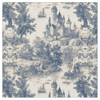
Blue and white decor is always a fresh way to bring peace and calm into a room. From the kitchen to the bedroom, blue and white patterns are welcome. Lately, an old classic has been trending: French Toile de Jouy is a classic, traditional pattern that has stood the test of time.
Design tastes for fabric and wall paper patterns come and go, but French toile always manages to stay elegant, graceful, and understated. It is especially beautiful in a vintage context.
French Toile De Jouy and Cottagecore Aesthetics
What styles are enhanced with this French-inspired pattern?
Farmhouse and Cottagecore come to mind.
As mentioned, American Colonial, and vintage English or French interiors were decorated with toile de jouy.
European informed style, especially in the more sophisticated color choice of charcoal black on ivory.
French toile patterns mix well with thoughtful pairings of checks or plaids in the same hue.
Although the 1970’s saw these patterns pop up in shirt fabrics, French toile is usually seen in interiors of our homes. Because it is strongly associated with the American colonial period, these designs become popular whenever Colonial decor is trendy. It also gets a pick-me-up in trending fashions when Designers incorporate it into their collections. Recently, that has been the case.
Bedrooms, especially, benefit from the monotone, elegant, and peaceful effect of toiles. Bucolic scenes of pretty countrysides or whimsical hot air balloons match the mood of our most intimate spaces.
Love the Vibe, but not in Blue?
Ruby red toile pattern wallpaper in bedroom
In Colonial times this fabric was used for curtains, bedding, and upholstery. Today, similar applications with the addition of wallpapers are gaining interest and popularity.
Toile in Today’s Interiors
An easy way to add fashion trends, particularly if you don’t want a long term commitment, is with pillows. The fine textured patterning of toile de jouy designs melds with solid areas of color.
Blue toile table runner available on Zazzle
Another fine use of toile de jouy is in table linens. A table runner, placemats, or cloth dinner napkins will accentuate the dining room with a seasonal spot of color.
More permanent ways to bring the monotone patterns into play are with wallpaper. Interesting detail without overwhelming modern, small spaces.
Origination of French Toile
Also known as “toile de Jouy“, while associated with the French, it actually originated in Ireland. Irishman Francis Nixon exchanged the printing process from wood block to the copperplate method that allowed for more detail, monocolored, bigger prints.
While the French word toile originally referred to linen, the Irishman Francis Nixon printed his designs on cotton. A factory in Jouy, France began printing these types of designs which then became wildly popular in the ln the late 18th-century. The scenes are usually pastoral, but embrace the more exotic, as well. Traditionally a soft blue on ivory, many color iterations and even patterns modified with color surprises can be found.
Patterns Come Alive
Fresh perspectives in topical elements can be found today, from original, new designs to fashion forward colors. For those with a love for vintage, the traditional birds and branches, gardens, castles, and Fragonard inspired people are readily available.
One of the most versatile ways to have the colors and designs you crave for certain rooms or products is to use a company like Zazzle. These patterns can be tailored to everything from stationary to bed duvets or bathroom towels. Cups, table linens, indeed hundreds of different home products, can be printed to order.
The historically printed patterns are usually shades of red, blue, green, or black on a white background. Today, pink, mustard, brown, and many other variants are used to create the single color prints.
Add Interest to Your Traditional Home
Has this taste of French toile whetted your appetite for layering interest and texture through these vintage prints? Give your home an addition of French Country style with accessories in the colors that appeal to you. You may find you love the subtle, relaxed look of these pastoral prints.
Martha Stewart has become an American icon, and her favored color palettes, especially the green that has infused much of her books and publications are part of her brand. The carefully edited color palettes that identify her magazine, television shows, and books feature a soft green with analogous harmonies. What does that mean when you are looking for the perfect shade of green to give a calm and peaceful sophistication to your own home? Read on to explore this color, in its variations and home decor applications.
Neutrals are backdrop for colorful flower arrangements and seasonal decor.
Martha Stewart's signature colors may change incrementally over the years, but each re-imaging melds with the next and that makes for an easily updated innovation as fashion tastes change.
This is a look at the shades, perhaps the origins, harmonies, and the look as it was in the past and for today from Martha Stewart's name and brand.
Martha Stewart Decorating, Turkey Hill and Lily Pond Shades
Martha Stewart's traditional style, in the early years, had the imprint of her own fresh look and edited palettes. Her homes, particularly 'Turkey Hill' had the soft earth tones that showcased antiques, flowers, and entertaining so well.
Turkey Hill Dining Room
The softly neutral, earthy tones bring a cohesion and harmony that would work well with today's leaning towards warm and natural earth tone interiors. This is something the Martha Stewart Brand has always done so well.
Pale ochre is classic. Ochre yellow is a yellow-brown pigment from natural minerals. It is the perfect backdrop for styles ranging from Victorian to minimal. The warmer colors are a relief from the ubiquitous grays of the "Covid years".
Because beige-based interior palettes can look so dated, it makes sense to observe just how Stewart blended and organized her color harmonies to achieve something so timeless.
Martha Stewart's use of neutrals is a lesser known signature color palette, which often tends towards the warm side of the spectrum. It works well with the deeper teal blues and makes oranges and yellow to shine and sparkle.
Colors: By Imaginatively Named Monikers
Once the Martha Stewart Living paint colors began appearing, a plethora of named colors sprouted. One of the reasons her color choices are so attractive and relaxing is that they seem to be mostly taken from natural objects. If one views the "Araucana" color group the nuances of tints taken from the eggs of that chicken breed makes perfect sense.
An exhaustive listof those names, paint chips, and formulations exist on My Perfect Color .com
Shades Of Earth
Martha Stewarts signature colors include names such as "Bee Balm Red", "Sandstone", "Pebble". these are colors that one might find in Colonial America, as well as the Arts and Crafts Era.
Earthtones circa 2007 as featured on one of the MSL magazine covers
"Martha Stewart Earth Tones" have Connections to History
Martha Stewart colors can be found in collectibles like McCoy Pottery, Depression glass, and Ruby Red glassware. Her designs for home goods can now be found on the Mayfair site and on her Amazon site.
Colors available now
Martha Stewart Miles Modern Diamond Anti-Fatigue Air-Infused Kitchen Mat, Spice Red, 19.6"x32" If you have a kitchen that has warm spice red accents, the foot saving feature of an anti-fatigue mat is a comfort that you will be grateful for, over and over. I especially like it underfoot by the stove because I cook more than I do dishes! It comes in other hues like beige,etc. but I have spice red accents in my kitchen.
Twenties Interior Example
20's Interior Colors example
It is easy to see the way earlier periods of interior color and decor have inspired Stewart's own style sense. Her palette lightens the hues, and tweaks them with some clarity. She minimizes the clutter, which is a hallmark of her rooms (especially as her style evolves).
The twenties era, in this case as envisioned by 'Armstrong Homes', used earth tones with contrasts of teal and smokey blue, as well as the familiar moss green. It is more intense and heavier in feel with the layering of textures, complex color harmonies, and fine details.
Martha's creates a more modern neutral look for the background of her rooms and sparks the color scheme with colorful flowers and accent pieces in stronger colors. She has chunkier statement pieces, less overall furniture and pattern. But you can see the same feeling within the colors chosen, in both her designs and this twenties example.
Martha Stewart colors on her instagram
A Thirties Kitchen In Pale Ochre, English Oak, and Geranium Red
The Thirties Kitchen that most exemplifies the later decorative choices for rooms seen at Turkey Hill and other residences is painted in a pale ochre. Martha Stewart may have called it "Rice Grain".
For a retro look in the warm earthy shades and tints that are popular now,
While looking into this palette of greens, I found that there is renewed interest in reproducing Martha Stewart Living articles and reminiscing about some of the favorite issues of the past. I know I have saved my past issues of Martha Stewart Living even after decluttering forced me to throw away many issues of other types of magazines (yes, I save magazines until forced to part with them- and I do mean forced by facing up to the fact that you can't hold onto everything).
Martha Stewart's site revisits the best paint color for neutral spaces. Want to see?
The Woman Herself
Known for Crafts, Cooking, Gardening, Decorating, and as a Savvy Business Woman, there are so many books on these topics on which she has put her able hands into.
And her products help the rest of us to do it, as well.
Give her colors a try whether you are seeking theme colors for a wedding or kitchen renovation ideas, they are always an inspiration.
Martha Stewart has become an American icon, and her favored color palettes, especially the green that has infused much of her books and publications are part of her brand. The carefully edited color palettes that identify her magazine, television shows, and books feature a soft green with analogous harmonies. What does that mean when you are looking for the perfect shade of green to give a calm and peaceful sophistication to your own home?
Read on to explore this color, in its variations and home decor applications.
Description of a Special Green Shade
Martha Stewart Green may change incrementally over the years, but there is a definite impression made in our minds of this soft and relaxing shade of green.
Looking here at its shades, possible origins, favored harmonies, and today’s interpretation of the green palette choices we have come to designate with Martha Stewart’s name and brand.
Martha Stewart Decorating, The Original Signature Green
Martha Stewart’s Signature Green is a soft Jade-ite tint.
Her decorating style is rooted in tradition, but I think what makes it so popular is the way those traditions are reinterpreted to reflect the general direction that tastes are trending in: more subtle, or brighter, etc.
Branding Through Color
Why does this work so well? It retains brand loyalty, harmonizes with other brands and the colors available in many stores, and gives a cohesive look that stands up to fashion trend change, all at the same time.
This green, in particular, has a timeless appeal. It could appear in my grandmother’s house, my mom’s, mine, or my daughter’s. It wouldn’t be a stretch to believe it could well be popular in the homes of my grandchildren in the future.
Compare this shade of green with the one so popular during the late sixties: Avocado green. It is interesting that one could span generations of popularity (in varying degrees) while another can become so dated in one decade.
Perfect shade for the Kitchen
A kitchen done in Martha Stewart’s Style
Martha Stewart’s use of green as a signature color has ranged from a bright minty hue to a soft celery green, and back. It has even at times been more of a khaki color, but it always seems to gravitate to that softly whitened green that could be best called “Martha Stewart Green”.
Green Craft Paint
Green Crafts Paint in this lovely green tint will be a nice departure from the usual harsh too-bright look.
Use in bedrooms or the kitchen, upscale old furnishings.
Green Glazed Kitchenware
Colors: By Any Other Name
Selection of interior paint colors in this family.
The green colors that we associate with the Martha Stewart Brand have been evolving in their own right. But once digging into the early magazine covers and articles, interior decorating books, and (if you are like me and have long loved Martha Stewart design sense) looking over the greens used for Martha Stewart brand garden tools, and kitchen wares… an interesting connection arises.
Shades Of Vert
The evolution of Martha Stewarts signature colors has gone through and evolution of shades. Other names might be Jadeite, Pistachio, or pale Apple Green. It is 42% saturated and 77% bright when the medium range is chosen.
Many are tints of Viridian green. This color is a blue-green pigment formulated in 1836 to replace the artist color of Paris Green, which was highly poisonous due to its lead content.
“Martha Stewart Green” has Roots in the Past
You probably don’t often think of greens that are known as “jade-ite” “institutional green”… or even further back in time “Venetian Green”, but these are well known names to the collector of 1930s glassware or restoration decorators reconstructing the 1920 to 1930 home styles.
If you like the colors that Martha Stewart is famous for, you might also like collectibles like McCoy Pottery, Depression glass, and Jadeite glassware. Because her colors are so “livable” they are widely available through design and paint lines in many stores, including Home Depot and Macy’s ( although not only those stores!)
Deeper and earthier shades
Twenties Green Kitchen
1920 Kitchen Palette
A Thirties Kitchen In Jadeite Green
A Thirties Kitchen was an inspiration for the signature green that helped build Martha’s empire.
A Thirties Kitchen was an inspiration for the signature green that helped build Martha’s empire. Jadeite Green – Modern and Collectible
Martha Stewart helped reintroduce Jadeite to many. This creamy green color was highly popular in the 1930s and 40’s. Many like it today for the retro look it gives their kitchen.
While looking into this palette of greens, I found that there is renewed interest in reproducing Martha Stewart Living articles and reminiscing about some of the favorite issues of the past. I know I have saved my past issues of Martha Stewart Living even after decluttering forced me to throw away many issues of other types of magazines (yes, I save magazines until forced to part with them- and I do mean forced by facing up to the fact that you can’t hold onto everything).
Martha Stewart’s site revisits the best room color designs of the past.
Martha Stewart “Stuff” – Crafts, Decorating, Cooking -She Does It All
And her products help the rest of us to do it, as well.
Always New Decorating Ideas: They are fresh and yet hark back to the traditional and familiar for a cozy home look.
I have the suspicion that people either love or hate Martha Stewart. So here is the place to find out for sure. I want to know: are you a fan of Martha Stewart or Not? What is it that earns your brand loyalty or rejection?
Whether it is kitchen gadgets or crafty things- Martha Stewart has such cute details and pretty colors, they are hard to resist.
Are you a fan of Martha Stewart? Or definitely not a fan? Why do you feel that way?
Give Green a Try in your own Color Scheme
– Are you thinking of green decor?
Martha Stewart
Being Martha: The Inside Story of Martha Stewart and Her Amazing Life There is a complete backstory to the empire, the branding, and the career and lifestyle of the famous Martha Stewart. Even the cover of her biography has her signature colors of green and blue, modernized and brightened up, but still easily recognized.
One of the ways I love to refresh the look of my house is to change decorations and pillows out seasonally. I know I am not alone in this. Pillows are fun, their cost is usually very reasonable, they are comfy and useful. Pillows are one of the most fun and eye-catching additions to home decor- from your intimate spaces in the bedroom to where you invite your guest, the living room.
Here is something bright and fun that you can easily order from Amazon:
Rustic lodge colors and fun fonts to spell out what we love aobut thie Autumn season!
My family also uses Amazon Prime often, which saves us money on shipping and more.
Please support my site by using my links, thank you. This Page may contain affiliate links. “As an Amazon Associate I earn from qualifying purchases”


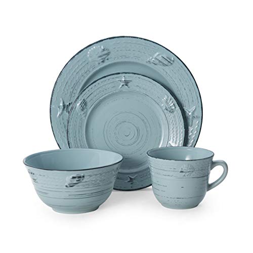 The embossed seashell motif is subtle but makes you think of easy beach house living. Relaxed mood for a great dining experience.