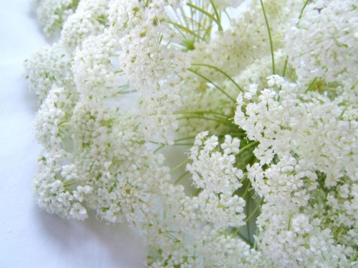
White, while it may be the absence of color in one form is the combination of all in another… thus starts the wonder of white.
This page catalogues some of the ways our eyes see the color of “white”, which is the combined spectrum of light. It has a place in our weddings, interiors, and even in food. Like all hues, the popularity and use of it changes over time. Here, we explore the meaning and history of the use of white as a color in our clothing, art and interiors.
Let’s look at the physical and emotional impact of white …
White as snow
Science: How Does the Eye See White?
“We perceive color when the different wavelengths composing white light are selectively interfered with by matter (absorbed, reflected, refracted, scattered, or diffracted) on their way to our eyes, or when a non-white distribution of light has been emitted.”
“Color is light. Light is electromagnetic radiation and over a range of wavelengths it makes an impression on the human eye. This range of wavelengths is the visual spectrum.
When light hits an object some wavelengths are absorbed and others are reflected. We see the reflected wavelengths of light as color. When all the wavelengths in the visual spectrum are absorbed we see black and when all are reflected we see white. When some are absorbed and some are reflected we see different colors of the spectrum.”
Science Facts
People respond favorably to white, and it promotes trust.
White reflects light and is considered a summer color.
The fact that white is seen as such is due to a reflection of almost all incident light, so that no one hue is apparent.
“Snow is actually colorless. It appears white because light is so scattered when it hits the snow reflecting back all the colors in light. Depending on where you find the snow, snow can actually appear red, blue, black, or green.
As light hits the snow on the ground, there are so many locations for light to be reflected, that no single wavelength of light gets absorbed or reflected with any consistency. Most all of the white light from the sun hitting the snow will reflect back and still be white light. Therefore, snow on the ground appears white.” – Life in Color
White hair has lost its pigment.
The psychological effect: of the color white is to bring feelings of peace and comfort..” White can be used to give yourself a feeling of freedom and uncluttered openness. Too much white can give feelings of separation and can be cold and isolating”.-thinkquest.org
White is not a mere absence of colour; it is a shining and affirmative thing, as fierce as red, as definite as black. God paints in many colours; but He never paints so gorgeously, I had almost said so gaudily, as when He paints in white.
— Gilbert Keith Chesterton
“As White As Snow”
Winter and Silver Shades
Winter white is an “off-white”: in more of the cream range, but not too yellow.Though it is a warm rather than cool tone. Ivory is the range of pale yellow tones to cream white. The term is used in textile, fashion, and interior decoration descriptions.
Hair is rarely called “white”, it is usually designated as silver. Perhaps due to the fact that for many it is mixed with gray or darker hair. It is hair that has lost its pigment.
Of the many shades of white, while a yellow cast is beloved in clothing and interior paint colors, it is eschewed in hair color. A blue cast is given through the use of shampoos which reflect the light in a more attractive shade.
Negative: Sterility, coldness, barriers, unfriendliness, elitism.” – — www.colour-affects.co.uk So where may the expression “lily white” have originated? The original white lily used in art was the “Madonna” lily, Lilium candidum. This ancient flower was associated with innocence and purity. More modern associations of this term are more negative.
The Language of Flowers
Blanc Double De Coubert
What do roses of this type mean?
The Message of a White Rose
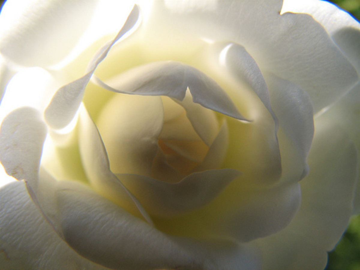
White roses have the meaning of “Purity, Innocence, Sympathy, Spirituality”.Early traditions also used white roses as a symbol for true love, but that has been replaced by the red rose in modern thinking. Commonly chosen as a traditional wedding flower in the bridal bouquet.
A Single White Rose symbolizes someone that wants to say ‘I’m sorry’. They can also send an “I miss you” message.
Clothing: White Dresses and White Weddings
Bridal White
Not all bridal gowns are a pure white, but in the popular mind, that is the color we think of first for wedding gowns. Some are shades of white ranging to ivory, and some brides choose to have tints of color.
Interestingly, this was not always the main choice for Brides. It only became popular after Queen Victoria of England led the way by her example.
The purity of white has come to symbolize the bride’s gown in European influenced cultures.
Pearls are the Well-dressed Woman’s Classic
While today they are often chosen as Brides jewelry, there was a time when any well dressed woman owned at least one strand of pearls.
White pearls never seem to go out of fashion. They speak of the sea, and their iridescence flatters skin of every shade and age. Pearls seem to be in the domain of women, much more than men, perhaps for this reason. They are soft and can be scratched, but they only grow better with natural oils from the skin or in ocean air.
Pearl Gems
More About Those Pearls
Of their color, my favorite is a soft white, but Wikipedia reports:
“Earrings and necklaces can also be classified on the grade of the color of the pearl. While white, and more recently black, saltwater pearls are by far the most popular, other color tints can be found on pearls from the oceans. Pink, blue, champagne, green, black and even purple saltwater pearls can be encountered, but to collect enough of these rare colors to form a complete string of the same size and same shade can take years.”
Another reference to a shade that is a pleasing form of the color we are exploring is “pearly”. Have you ever heard of “pearly whites” as a euphemism for teeth? Symbolism associated with pearls are
innocence, beauty, sincerity, and new beginnings
water and the moon
wisdom and rare value
White Diamonds
Another gem described as white and used also as a modifier for the color is a white diamond. Like pearls, the color of the gem is usually white, but also comes in an array of other shades (yellow, pink, etc); although that is where the similarity ends. Pearl-white is soft, diamond-white is hard.
Couples commonly chose this gem for their engagement and wedding rings.. Because of its value, as well as symbolizing eternity, everlasting love.
A diamond ring for marriage, “eternity”.
Rating diamonds by color: The finest quality diamond is totally colorless. Diamonds are rated for color, among other qualities. Graded as a “D” color diamond a colorless diamond is considered absolutely free from any color, and is valued all over the world. Most diamonds in jewelery are white diamonds. A rating system is used for color in white diamonds, from “D” to “Z” ,with D being “colorless” and Z having a bright yellow hue.
Impurities and structural imperfections cause different colors in diamonds. Interestingly, some highly colored diamonds, which are rare, are most valued.
Trivia Facts about the Color White
Queen Elizabeth I
When White Was a Sign of Luxury
Laws called the “Sumptuary Laws” dictated who could wear the color white during Elizabethan times. Queen Elizabeth I wore white.
“People who were allowed to wear the color white during the Elizabethan era, as decreed by the English Sumptuary Laws, were lower and upper classes”
Apparently, the rich wore a pristine white which was difficult to produce and keep clean, while the poor could wear “the natural, cheap, off-white color of wool”.
Literary Expressions of Whiteness
-William Shakespeare ‘Hamlet’, 1602:
… What if this cursed hand
Were thicker than itself with brother’s blood,
Is there not rain enough in the sweet heavens
To wash it white as snow?
Shakespeare used snow as a symbol for purity and whiteness in several plays, in The Winter’s Tale and Macbeth, as well as Hamlet. We commonly hear this simile today.
A Few Colorful Phrases
An example of this expressed in literature: (“lawn” is a type of fine fabric”.}
Lawn as white as driven snow, Cyprus black as e’er was crow, Gloves as sweet as damask roses, Masks for faces and for noses, Bugle bracelet, necklace amber, Perfume for a lady’s chamber, Golden quoifs and stomachers For my lads to give their dears, Pins and poking-sticks of steel What maids lack from head to heel.
Did You Know these Beliefs?
White cats are a symbol of good luck in America.
A white flag is the universal symbol for truce.
White stands for mourning in China and Japan.
Many hobbies, and fashions show the fascination that people have with the effect of white. ‘Whitework’ embroidery, white gardens, white interior decorating schemes, white weddings, those topics (and more) are where we direct our lens to understanding more about this color, which is the sum of all colors.
Peace, comfort… these are two associations made, and there is something clean and refreshing about the color white. To further see the paradox of it, observe: “White as snow” means something very pure. Yet, “whitewash” can mean the opposite, with an ominous reference to there being something not quite right, or downright wrong and covered over.
Visually, when you want to refresh the eye, a strong dose of “whitespace” is just what is needed.
Summer holds an invitation to wear white
We love the cool feeling that white gives us in summertime, when the temperatures rise and colors burst around us. White holds a simplicity which works well with textures and intricacies of fabrics and lace… layers of texture never seem too much when done in a white on white palette.
Little Girls in White Summer Dresses
Whitework Embroidery
whitework embroidery
A beautiful embroidery technique in which the stitching is the same color as the fabric (traditionally white linen). Often used for baby christening gowns. Some of these are”
Ayrshire work
Broderie Anglaise
Mountmellick
Richelieu
Some of these embroideries are used in Bridal Gowns.
Completely or predominately white or cream colored blossoms, grey foliage, and white variegated plantings are the components of white gardens. The effect is cool and striking. In her garden at Sissinghurst, Vita Sackville-West has one of the most famous white garden examples in the world.
Carnations are often included in rose arrangements. White color in a carnation denotes a pure love and its meaning is of admiration, honor and gratitude. It was often given to a teacher.
Additionally, white carnations can also stand for a wish for good luck.
Interiors: Painting It WHITE
Benjamin Moore paint samples of some white colors available
All White Interiors
-Just don’t let the kids loose! Everyone has seen them, because all-white interiors are so sophisticated in feeling, but many people live with color and let the fashion magazines have their pure white rugs and sofas.
All white kitchens and bathrooms, with their hard surfaces are popular ways to have an all white interior. Usually unrelieved by color accents or the interplay of textures, such rooms have a sterile feeling
Many Shades of Pale
Colors with white added are called “tints”, while colors with black added are called “shades”. A lot of white can be used in a practical way as well, though. and lend a light filled interior with an open and fresh feeling. Beach cottages, Seaside houses, and Old Farmhouses all benefit from lots of white, used in paint and fabrics.
Interior Effects
White Interior decor
Decorators never tire of it, and all-white schemes are a perennial presentation. For the life of me, I cannot understand why white carpeting would be desired when you have a growing household of children. Yet, the draw of that pristine look keeps it a top choice in many new home designs.
Want white painted walls for your monochromatic layered look of bed linens and boudoir accessories? Be prepared for myriad choices in the nuanced world of white, off-white, and creams. However, while called white, many paints have hints of pastels, gray, and neutrals shading the paint pigments.
Pleasing White Paints:
Benjamin Moore’s Moonlight White
Benjamin Moore’s Dove White
Using this scheme on walls is another proposition altogether from starkly minimal, monochromatic look. Many love white walls, and a satin or eggshell finish paint is easy to clean. The open feel, and the way this color on wall and ceiling can blend all the other elements of a room together makes it a favorite for interior spaces.
On the “light” side:
Mae West:
“I used to be Snow White, but I drifted.”
“Snow White” Fairytale
Source
Snow White
“A little daughter, who was as white as snow, with lips as red as blood, and her hair was as black as ebony, and she was therefore called little Snow-White” so the fairytale goes, and the very pale skin is the origin of the name. Of course, “white skin” is not a pure white color, but simply very pale with less melanin, the pigment that colors human skin.
Places
White Beaches of Destin, Florida
On the Gulf of Mexico is a gorgeous vacation location, the beaches of Destin, Florida and all along the “Emerald Coast”. Read more about this destination.
White Sands National Monument located in New Mexico
“The pure gypsum (hydrous calcium sulfate) that forms these unusual dunes originates in the western portion of the monument from an ephemeral lake or playa with a very high mineral content. As the water evaporates (theoretically as much as 80″ per year!), the minerals are left behind to form gypsum deposits that eventually are wind-transported to form these white sand dunes.”
Martha Stewart has become an American icon, and her favored color palettes, especially the green that has infused much of her books and publications are part of her brand. The carefully edited color palettes that identify her magazine, television shows, and books feature a soft green with analogous harmonies. What does that mean when you are looking for the perfect shade of green to give a calm and peaceful sophistication to your own home? Read on to explore this color, in its variations and home decor applications.
Neutrals are backdrop for colorful flower arrangements and seasonal decor.
Martha Stewart's signature colors may change incrementally over the years, but each re-imaging melds with the next and that makes for an easily updated innovation as fashion tastes change.
This is a look at the shades, perhaps the origins, harmonies, and the look as it was in the past and for today from Martha Stewart's name and brand.
Martha Stewart Decorating, Turkey Hill and Lily Pond Shades
Martha Stewart's traditional style, in the early years, had the imprint of her own fresh look and edited palettes. Her homes, particularly 'Turkey Hill' had the soft earth tones that showcased antiques, flowers, and entertaining so well.
Turkey Hill Dining Room
The softly neutral, earthy tones bring a cohesion and harmony that would work well with today's leaning towards warm and natural earth tone interiors. This is something the Martha Stewart Brand has always done so well.
Pale ochre is classic. Ochre yellow is a yellow-brown pigment from natural minerals. It is the perfect backdrop for styles ranging from Victorian to minimal. The warmer colors are a relief from the ubiquitous grays of the "Covid years".
Because beige-based interior palettes can look so dated, it makes sense to observe just how Stewart blended and organized her color harmonies to achieve something so timeless.
Martha Stewart's use of neutrals is a lesser known signature color palette, which often tends towards the warm side of the spectrum. It works well with the deeper teal blues and makes oranges and yellow to shine and sparkle.
Colors: By Imaginatively Named Monikers
Once the Martha Stewart Living paint colors began appearing, a plethora of named colors sprouted. One of the reasons her color choices are so attractive and relaxing is that they seem to be mostly taken from natural objects. If one views the "Araucana" color group the nuances of tints taken from the eggs of that chicken breed makes perfect sense.
An exhaustive listof those names, paint chips, and formulations exist on My Perfect Color .com
Shades Of Earth
Martha Stewarts signature colors include names such as "Bee Balm Red", "Sandstone", "Pebble". these are colors that one might find in Colonial America, as well as the Arts and Crafts Era.
Earthtones circa 2007 as featured on one of the MSL magazine covers
"Martha Stewart Earth Tones" have Connections to History
Martha Stewart colors can be found in collectibles like McCoy Pottery, Depression glass, and Ruby Red glassware. Her designs for home goods can now be found on the Mayfair site and on her Amazon site.
Colors available now
Martha Stewart Miles Modern Diamond Anti-Fatigue Air-Infused Kitchen Mat, Spice Red, 19.6"x32" If you have a kitchen that has warm spice red accents, the foot saving feature of an anti-fatigue mat is a comfort that you will be grateful for, over and over. I especially like it underfoot by the stove because I cook more than I do dishes! It comes in other hues like beige,etc. but I have spice red accents in my kitchen.
Twenties Interior Example
20's Interior Colors example
It is easy to see the way earlier periods of interior color and decor have inspired Stewart's own style sense. Her palette lightens the hues, and tweaks them with some clarity. She minimizes the clutter, which is a hallmark of her rooms (especially as her style evolves).
The twenties era, in this case as envisioned by 'Armstrong Homes', used earth tones with contrasts of teal and smokey blue, as well as the familiar moss green. It is more intense and heavier in feel with the layering of textures, complex color harmonies, and fine details.
Martha's creates a more modern neutral look for the background of her rooms and sparks the color scheme with colorful flowers and accent pieces in stronger colors. She has chunkier statement pieces, less overall furniture and pattern. But you can see the same feeling within the colors chosen, in both her designs and this twenties example.
Martha Stewart colors on her instagram
A Thirties Kitchen In Pale Ochre, English Oak, and Geranium Red
The Thirties Kitchen that most exemplifies the later decorative choices for rooms seen at Turkey Hill and other residences is painted in a pale ochre. Martha Stewart may have called it "Rice Grain".
For a retro look in the warm earthy shades and tints that are popular now,
While looking into this palette of greens, I found that there is renewed interest in reproducing Martha Stewart Living articles and reminiscing about some of the favorite issues of the past. I know I have saved my past issues of Martha Stewart Living even after decluttering forced me to throw away many issues of other types of magazines (yes, I save magazines until forced to part with them- and I do mean forced by facing up to the fact that you can't hold onto everything).
Martha Stewart's site revisits the best paint color for neutral spaces. Want to see?
The Woman Herself
Known for Crafts, Cooking, Gardening, Decorating, and as a Savvy Business Woman, there are so many books on these topics on which she has put her able hands into.
And her products help the rest of us to do it, as well.
Give her colors a try whether you are seeking theme colors for a wedding or kitchen renovation ideas, they are always an inspiration.
Desire love, nurture, health, knowledge and wealth? This color is associated with all of those things. Red is a color of passion and love most of all, and it is the chosen shade for romantic gifts of roses and everything on Valentine’s Day. The gemstone ruby and the color red are forever paired as the most intense and passionate symbol of romance.
Rubies
The name of “ruby” comes from its coloration, the Latin “ruber” meaning red.They are valued more highly than diamonds if their size and quality are exceptional.Its preciousness has been a standard from ancient times:
Proverbs 3:15-18 She is more precious than rubies; nothing you desire can compare with her.
Ranging from pink to blood-red, the most desirable shade is called “pigeon blood”. Related gems are garnets and spinels in color, but surprisingly in substance, it is the Sapphire which is identical except for minerals that give its hue. A traditional gemstone gift for 15th and 40th wedding anniversary, and the birthstone of July.
The character of this gem is:
nobility
purity
passion
energy
courage
In the past, People believed rubies bestowed health, wisdom, wealth and success in love.
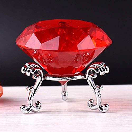
Place a fun accent of ruby on your desk, to be used as a paperweight or simply as a cheerful eye-catcher. Or make a lovely and meaningful gesture as a message that you value someone more than rubies. A delightful crystal measuring 60mm (2.36″); with a silver tone stand.
As a gem, one of the finest is a deep red with a hint of purple, called “pigeon’s blood”. It is the mineral corundum which has trace amounts of the element chromium; the greater the amount of chromium, the stronger the color.
This gem is the chosen birthstone for July. It is the traditional gift for a 40th wedding anniversary.
Proverbs 31:10. “Who can find a virtuous woman? for her price is far above rubies.”
Tradition says that the ruby was the most precious of the 12 stones created by God.
Ruby red slippers | Creative Commons Attribution-Share Alike 3.0
Dreaming about Ruby Red?
In dreams, this color represents much the same elements stated in its symbolic attributes:
passion, love
strength, energy
excitement, enthusiasm
leadership, warrior, masculinity
anger, war, fighting, even bloodshed
Dreaming of the jewel represents friendship, love, wisdom, vitality. It can also stand for commitment and peace. The blood red hue associated it with life force.
Dreaming about a red car means you want to get somewhere fast, and indicates you are sporty and dynamic. It can also be a warning to not let your emotions, especially anger, drive you.
Alert
The hue of bright red can raise blood pressure and speed respiration and heart rate.
What Personality Owns a Red Car?
Kate Smith, president of a color consultation company, says it indicates a magnetic, energetic personality which is goal-driven. If your vehicle is the deeper color of ruby, it show you are sophisticated, and more subtle of your desire for attention. Assertive with an A for Alpha profile.
Ruby Red Interiors
The psychological effect of red is motivating and exciting. It can be arousing, or it might be threatening. A stimulating conversation and convivial atmosphere is inspired in living and dining rooms.
Accents bring liveliness and draw the eye. Nothing demands attention quite like a bold red. It is famously paired with stark black and white to produce a classic combination. Usually found in a modern design, more traditional interiors use a toned rendition: charcoal, linen, and burgundy.
Room decor with rich deep red interior.
When this rich hue is used for walls, window treatments, and furnishings, it creates a powerful invitation to enjoy the warmth and cozy feeling, intensified by the small dimensions of the room.
Which paint gives a good ruby red color? Benjamin Moore has a shade called ‘Ruby Red’ in their Color Preview collection. ‘Ruby Dusk’ by the same brand is a very dark shade for a different effect or as an accent. Sherwin-Williams has an eggshell interior selection named ‘Ruby Red Slippers’. Explore your favorite brand line to see if they carry choices with the jeweled name and color.
Sparks of interest bring a color scheme alive when a soupçon of ruby red is added. I love this color as part of a white kitchen. It brings warmth to winter holidays and combines well with other primaries for any time of year.
To Sum It Up
Rubies are prized for their beauty and endurance ( due to their hardness), they symbolize all the feelings of their color: warmth of love and passion, strong emotions of anger and lust, life force and protection. From ancient times they were rated as one of the top gems for loveliness and value.
The color has a stimulating effect and draws attention more than any other. If you want to stir things up, use the deep jewel red.
It is a strong color and might be “too much of a good thing” for some, but it holds a place of admiration and desire in the hearts of most cultures and many people.
Martha Stewart has become an American icon, and her favored color palettes, especially the green that has infused much of her books and publications are part of her brand. The carefully edited color palettes that identify her magazine, television shows, and books feature a soft green with analogous harmonies. What does that mean when you are looking for the perfect shade of green to give a calm and peaceful sophistication to your own home?
Read on to explore this color, in its variations and home decor applications.
Description of a Special Green Shade
Martha Stewart Green may change incrementally over the years, but there is a definite impression made in our minds of this soft and relaxing shade of green.
Looking here at its shades, possible origins, favored harmonies, and today’s interpretation of the green palette choices we have come to designate with Martha Stewart’s name and brand.
Martha Stewart Decorating, The Original Signature Green
Martha Stewart’s Signature Green is a soft Jade-ite tint.
Her decorating style is rooted in tradition, but I think what makes it so popular is the way those traditions are reinterpreted to reflect the general direction that tastes are trending in: more subtle, or brighter, etc.
Branding Through Color
Why does this work so well? It retains brand loyalty, harmonizes with other brands and the colors available in many stores, and gives a cohesive look that stands up to fashion trend change, all at the same time.
This green, in particular, has a timeless appeal. It could appear in my grandmother’s house, my mom’s, mine, or my daughter’s. It wouldn’t be a stretch to believe it could well be popular in the homes of my grandchildren in the future.
Compare this shade of green with the one so popular during the late sixties: Avocado green. It is interesting that one could span generations of popularity (in varying degrees) while another can become so dated in one decade.
Perfect shade for the Kitchen
A kitchen done in Martha Stewart’s Style
Martha Stewart’s use of green as a signature color has ranged from a bright minty hue to a soft celery green, and back. It has even at times been more of a khaki color, but it always seems to gravitate to that softly whitened green that could be best called “Martha Stewart Green”.
Green Craft Paint
Green Crafts Paint in this lovely green tint will be a nice departure from the usual harsh too-bright look.
Use in bedrooms or the kitchen, upscale old furnishings.
Green Glazed Kitchenware
Colors: By Any Other Name
Selection of interior paint colors in this family.
The green colors that we associate with the Martha Stewart Brand have been evolving in their own right. But once digging into the early magazine covers and articles, interior decorating books, and (if you are like me and have long loved Martha Stewart design sense) looking over the greens used for Martha Stewart brand garden tools, and kitchen wares… an interesting connection arises.
Shades Of Vert
The evolution of Martha Stewarts signature colors has gone through and evolution of shades. Other names might be Jadeite, Pistachio, or pale Apple Green. It is 42% saturated and 77% bright when the medium range is chosen.
Many are tints of Viridian green. This color is a blue-green pigment formulated in 1836 to replace the artist color of Paris Green, which was highly poisonous due to its lead content.
“Martha Stewart Green” has Roots in the Past
You probably don’t often think of greens that are known as “jade-ite” “institutional green”… or even further back in time “Venetian Green”, but these are well known names to the collector of 1930s glassware or restoration decorators reconstructing the 1920 to 1930 home styles.
If you like the colors that Martha Stewart is famous for, you might also like collectibles like McCoy Pottery, Depression glass, and Jadeite glassware. Because her colors are so “livable” they are widely available through design and paint lines in many stores, including Home Depot and Macy’s ( although not only those stores!)
Deeper and earthier shades
Twenties Green Kitchen
1920 Kitchen Palette
A Thirties Kitchen In Jadeite Green
A Thirties Kitchen was an inspiration for the signature green that helped build Martha’s empire.
A Thirties Kitchen was an inspiration for the signature green that helped build Martha’s empire. Jadeite Green – Modern and Collectible
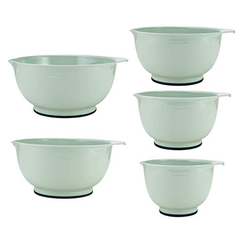
Martha Stewart helped reintroduce Jadeite to many. This creamy green color was highly popular in the 1930s and 40’s. Many like it today for the retro look it gives their kitchen.
While looking into this palette of greens, I found that there is renewed interest in reproducing Martha Stewart Living articles and reminiscing about some of the favorite issues of the past. I know I have saved my past issues of Martha Stewart Living even after decluttering forced me to throw away many issues of other types of magazines (yes, I save magazines until forced to part with them- and I do mean forced by facing up to the fact that you can’t hold onto everything).
Martha Stewart’s site revisits the best room color designs of the past.
Martha Stewart “Stuff” – Crafts, Decorating, Cooking -She Does It All
And her products help the rest of us to do it, as well.
Always New Decorating Ideas: They are fresh and yet hark back to the traditional and familiar for a cozy home look.
I have the suspicion that people either love or hate Martha Stewart. So here is the place to find out for sure. I want to know: are you a fan of Martha Stewart or Not? What is it that earns your brand loyalty or rejection?
Whether it is kitchen gadgets or crafty things- Martha Stewart has such cute details and pretty colors, they are hard to resist.
Are you a fan of Martha Stewart? Or definitely not a fan? Why do you feel that way?
Give Green a Try in your own Color Scheme
– Are you thinking of green decor?
Martha Stewart
Being Martha: The Inside Story of Martha Stewart and Her Amazing Life There is a complete backstory to the empire, the branding, and the career and lifestyle of the famous Martha Stewart. Even the cover of her biography has her signature colors of green and blue, modernized and brightened up, but still easily recognized.
One of the world's largest-known faceted blue sapphires.
Looking Deeply Into The Blues
A favorite color of many men and a large cohort of women, this hue of the heavens brings calm and reassurance. Gemstones of sapphire, lapis lazuli, turquoise, and aquamarine have been sought since ancient times. Usually considered a beneficial color that elicits thoughts of loyalty, sincerity, stability, and a spiritual aspect.
Revealed with the Sapphire jewel tone (which means "blue" in the Greek) are other shades of this popular shade of the color spectrum.
Psyche Effects
Blue brings calm in real physical effects. It slows metabolism, brings down blood pressure, heart rate, and promotes relaxed breathing (1) . Because it feels restful to us, it is a favorite choice for bedrooms. Cool shades generally are more restful to the eye, thus making us feel more peaceful.
Characteristics of blue:
calmness
serenity
truth
wisdom
focused
loyalty
cold
un-appetizing
uncaring
We usually consider blue a "safe" color, as it recedes from the foreground and doesn't irritate the way a bright red or yellow might. The clean effect of white paired with this cool shade creates a look that is classic in porcelain and pottery, as well as fabrics. Combined with red or yellow, its companions in the primary color group, create a bright and cheerful feeling. Deepened into its darkest shade, midnight, it holds mystery and strength.
Classic Blue Instilling calm, confidence, and connection, this enduring blue hue highlights our desire for a dependable and stable foundation on which to build as we cross the threshold into a new era.
While the color of the year for 2020 has received a fair share of criticism for being too safe and stodgy, when a tint like Serenity Blue is chosen it is immediately more playful and optimistic. That was the choice for year 2016. But whether you love a shade of this cool color or not, it is eminently mixable. Soothing in pastel harmonies or bright and sharp in primary collections, the mood can change when companion hues are brought into play.
What Is The Dream Meaning of Blue Objects?
If something is represented in this color it could have symbolic meanings of "Truth, faith, peace, or clear communication". It might be a reflection of your own feelings when seeing the color of sky or water or when mixed with a certain emotion in the dream.
Blue Gemstones and their Symbolism
Sapphires are the pre-eminent blue gemstones. The very name, sappheiros, is the Greek word for a stone reflecting this portion of the spectrum; although it originally referred to the mineral lapis lazuli. Known as a symbol of new love and commitment. Additionally, it is said to be the wisdom stone.
Lapis lazuli was once ground up to give its ethereal tones to illuminated scriptures as "ultramarine". It holds its association with heavenly things to this day. Its meaning is in conjunction with everything good that blue stands for: truth, intellectual creativity, strength, courage, and royalty.
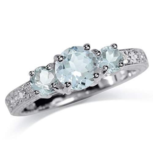
Aquamarine is thought of as a "good luck" stone, and energizing. The connotations of harmonious and happy relationship make it an ideal representative of friendship and marital happiness.
Blue Flowers
Forget-me-nots have their own shade named for them. Photo by Gemma Evans on Unsplash
Romantics rendered cobalt tints for desire and love, or the striving beyond one's reach. It symbolized hope and the beauty of things.
Forget-me-not: True Love; Memories
Bachelor Button: Single Blessedness
Hyacinth Blue: Constancy
Flax: Domestic Bliss
Iris: "Your Friendship Means So Much to Me"; Faith; Hope; Wisdom and Valour; "My Compliments"
True Blue For You
A common theme of meaning in all of the aspects of this hue is the sense of honesty, bravery, faithfulness, and for many, a conservative personality. It can be spiritual or mundane, but it imparts inner peace and calm.
To have the greatest impact, use a color in a monotone way. To emphasize a certain feeling or to change the mood to something else entirely try different palettes of color. Experiment with using blue with other partners on the color wheel: contrast blue with orange; pair it with yellow or red; soften it with pink; warm it with violet. Each match will give its own feeling and impress its meaning individually and culturally.
My family also uses Amazon Prime often, which saves us money on shipping and more.
Please support my site by using my links, thank you. This Page may contain affiliate links. “As an Amazon Associate I earn from qualifying purchases”